

Redditor TeaDranks has created a super-interesting cartogram in which the size of each country is apportioned according to population. Suddenly, the largest countries in the world don't look so mighty — Russia and Canada, we're looking at you.
What's cool about this map is that TeaDranks managed to maintain the shape and relative position of each county in such a way that the global map is still highly recognizable.

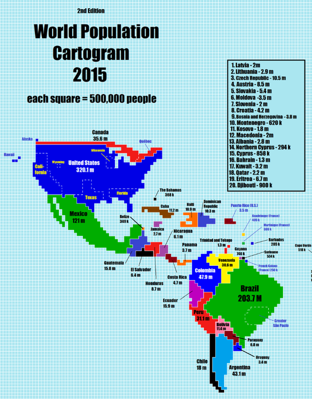
South America and Europe (excluding Russia) look somewhat normal, though a bit distorted. North America looks like it had its head chopped off, while China and India absolutely explode off the page. Africa also retained its basic shape, but it's clear that Nigeria dominates in terms of population size.


Poor Australia is almost nowhere to be seen, while Japan and the Philippines look much larger than what we're accustomed to.
In the map, each square represents 500,000 people, which means some countries couldn't be represented at all.

"I hope this map educates people and allows them to understand the world a bit better," TeaDranks told io9. "I also hope it sparks their interest in maps, which I'm very passionate about."
You can find a hi-res version of the map here


